
Notification centre
Woolworths Shop App
Grow sustained Apps engagement and connect our App ecosystem
About this project
WooliesX aimed to transform the personalisation experience across its digital ecosystem, beginning with an uplift of the Woolworths app Notification Centre. This initiative formed part of a broader strategy to deliver targeted and contextual communications, and ultimately scale these capabilities across the entire product suite.
I was engaged to help optimise and increase the Notification Centre capabilities and journeys. We achieved this by building a Message Centre entry-point within Notification Centre and new order notifications to increase awareness and engagement
The Notification Centre initiative aimed to improve how users access and interact with order updates, promotions, and support messages. This research round focused on:
Comprehension of combined Live Agent & Notification messaging
Findability and usability of order-related notifications
Preferences around card-based notification UI
Evaluation of icons, labels, and hierarchy
Pain Points – Verbatim
“The app is fine, but there needs to be the ability to retrieve past notifications. Today the Woolworths app sent me an offer, which I missed and for the life of me couldn’t find out what it was. I googled it, checked the Rewards app and also tried looking for it on the Woolworths app.”
— User review from App Store
“Customers expressed that they hadn’t used the Woolworths Notification Centre before, therefore would not expect to go there”
We needed to build and enhance app communication capabilities, automations, and personalised experiences to help drive customer engagement
“Customers expressed that they would learn to ignore general and less relevant notifications.”
Notifications should be timely and meaningful, preferably before entering the store, so customers can adjust shopping behaviours.
“Customers expressed that this would best be utilised in a light touch approach. Customers should not feel we are bombarding them with information that is not helpful. If so, they may seek to proactively turn these notifications off.”
Keep information minimal to avoid overwhelming users and maintain engagement.
“Customers’ mental activity in store will not be shared with many other in-store activities and will likely be unable to pay full attention to notifications as they are received.”
Explore the need for a Notification Centre that allows users to revisit missed or dismissed notifications.
Many customer also said they hadn’t used the Woolworths Notification Centre before, therefore would not expect to go there
Objectives
The existing Notification Centre MVP, which had remained largely untouched since 2022 and was significantly under-utilised primarily surfacing generic promotional messages with limited user engagement. This piece of work involved designing, testing, and validating a proposed integration between the Live Agent experience and the Notification Centre,
The work was both strategic and complex, feeding directly into a broader cross-channel contact strategy, which I also led. While that larger initiative can be shared as a standalone case study, this particular write-up focuses on the Notification Centre uplift within the Shop App (WoW App).
What was in scope…
Exploration of new notification card mechanics and visual components
Appetite for receiving order-related notifications
The feasibility and user comprehension of a combined message access point
I led vision alignment workshops and customer journey mapping sessions to visualise both the current experience and future-state opportunities. This included conceptual design (ideation and wireframes), insight synthesis, visual design, and iterative customer testing to refine notification components — ultimately delivering a new, scalable design ready for handover.
What I did…
We set out to understand how users interact with the proposed Notification Centre uplift by testing:
Comprehension of a combined Live Agent + Notification model
Appetite and clarity around order-related notifications
Preferences for notification card layouts, icons, and terminology
To explore these, we conducted several five 1-hour remote interviews with high-frequency WoW app users (ages 31–51). Sessions included prototype interaction, task-based walkthroughs, and open discussion, using tools like Figma, Miro, and Askable.
Following extensive ideation, co-design workshops, and alignment with stakeholders and product leads, we developed a series of concepts to take into user testing.
Over the six-week engagement, my responsibilities spanned end-to-end product design — including early sketching, research planning, prototype creation, setting up testing via Askable, research synthesis and playback, stakeholder engagement, strategy development, PM alignment, roadmap planning, concept testing, UI design, design system alignment, component build, and final handover of dev-ready assets.


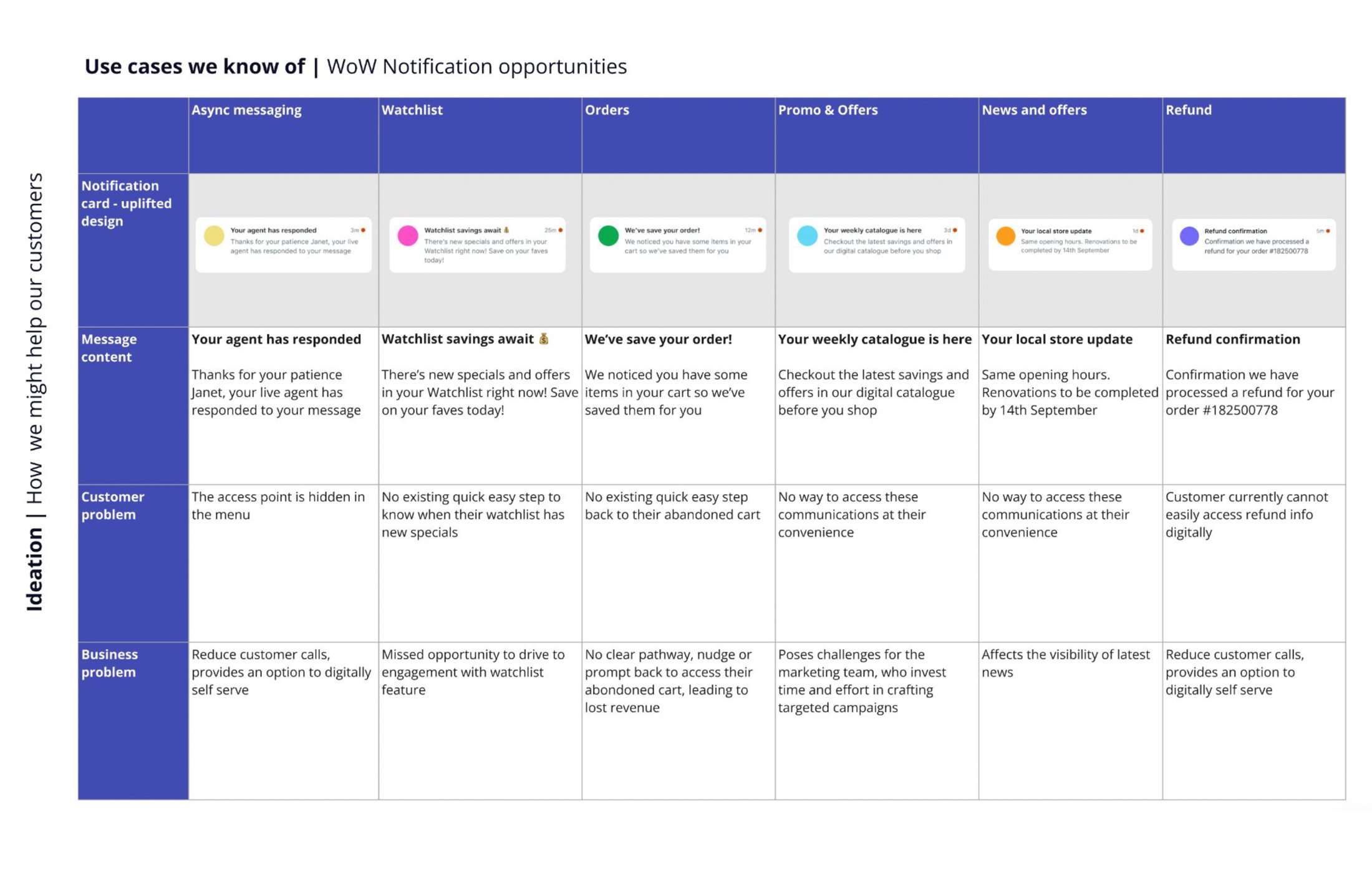
UI Deliverables and approach
I led a series of collaborative workshops with UI designers to define and deliver an uplifted, scalable notification card component to be used across both the Woolworths and Everyday Rewards apps. These sessions focused on aligning UI patterns with accessibility standards, ensuring consistency across platforms, and balancing flexibility with clarity. The goal was to design a component that could support a wide range of message types from order updates to promotional offers - while remaining visually clean, intuitive, and easy to scan.
Although this work was originally descoped from immediate development, it has since been integrated into the product roadmap for future implementation. I’m incredibly proud of what we delivered — not only because of the design quality, but because we laid the foundation for a system-wide uplift of a critical and often overlooked part of the app experience. As part of this, we also mapped out key notification use cases and aligned them with clear, consistent iconography to support better scannability and user comprehension across both apps.


Insights & outcomes
User testing revealed a strong preference for the speech bubble icon, with red notification indicators seen as intuitive. However, users were unsure about combining chat and notifications under a single icon. While order notifications were understood once surfaced, most did not expect to find them in the Notification Centre.
Visual card layouts featuring imagery were preferred over text-heavy versions, which users found overwhelming. Labels like “News” and “Updates” caused confusion, highlighting the need for clearer structure, subgrouping, and visual hierarchy to support usability and discoverability.
Following iterative testing and refinements to entry point icons, layout options, and label groupings, the solution was successfully launched in the Woolworths app. The combined entry point, updated icon, and new order notifications were well received by customers.
This work forms part of a broader strategic initiative focused on a contact strategy and personalised experiences.
For more detail or a walkthrough of the full case study, please get in touch.
What Went Live
I led the end-to-end product design and delivery of the new order tracking notifications and the combined entry point for the message centre and live chat experience.